Originally published on http://www.godesignergo.com
Do you remember that saying your parents always touted when you were a child? Don’t judge a book by its cover? Yeah, I remember that one. While this is good advice to follow for meeting new people, I would not say the same when it comes to actual book covers.
Book covers are the first thing that readers look at when deciding their purchase. Just like Facebook or Twitter’s cover photos, they serve as a billboard to advertise the content on the inside. Misrepresenting what’s on the inside could prove to be detrimental to sales.
In Hollywood, executives will buy scripts and properties that already have an audience. They want something that is a guaranteed money maker. The same is for covers. Book design will often go back to what is a tried and true method. That’s why you won’t see much innovation on your shelves, especially in the last decade. You will most likely see a shadowed figure or blood spatter on mystery novels. Enter Fabio riding bareback on a horse for this year’s steamy summer romance. Your job as a writer is to stand out from these other titles.
So, what exactly makes a good cover, you ask? Good question. When you are getting shown book cover ideas by your publisher or designer, you need to make sure that the title and your name are in a legible font. I know, that’s so simple to think about but often is overlooked by publisher’s and their designers. They’re thinking that Rage Italic font looks so kitschy on the cover but rendered your name illegible. This is also something to be aware of on the spine of your book as well. While not a problem for our EBook writers, many writers that went the traditional route will be placed spine out on your Barnes and Noble store shelves which means you have that tiny of a space to capture your reader’s attention. Make sure you’re legible!
The design itself should be simple enough to look at but somehow convey the themes of the book without giving away the entire plot. This will also vary from genre to genre. For this article’s sake, I will be talking about Young Adult (since that is what I write!). Fantasy books usually have a surreal tone while those dystopian novels will feel dark and edgy. For me, the best covers don’t have real life models on them since I know I was embarrassed to be seen holding those books out in public when I was that age.
Our self-published authors are at a bit of a disadvantage. If you’re looking at your eReader, the covers are all in black and white. That means you don’t have the advantage of using eye catching colors to draw people to your cover. In this case, they must rely on what the pictures show themselves. A lot can be done with black and white and shades of gray, but it’s something to be aware of with that added challenge when talking to your designer.
Let’s take a look at an example of what I think is a good cover and what I think is a bad one in the world of YA.
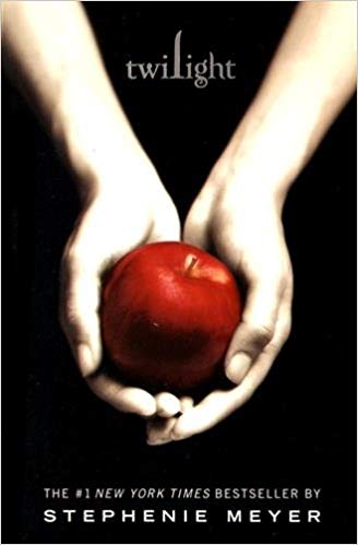
Here we have the worldwide phenomenon in Young Adult that was Twilight by Stephenie Meyer. How did an arguably mediocre book with such polarizing reviews become a best seller? Part of it was the book cover design. Just like a business card can, the font used for the title became an icon. It’s aesthetically pleasing to look at and distinguishable from all other titles on the shelf. The design itself with the hands holding an apple is easy on the eyes. When I look at the cover, I don’t have any negative feelings towards it, if anything it’s positive. It clearly harkens back to the Bible with Eve stealing the forbidden fruit. But why would a biblical reference be relevant to a book about vampires? Well, knowing the genre, this will most likely be a romantic story and the love will be forbidden in some way. Bingo.
Whether you like the Twilight series or not, the cover design gives a general idea of what you’ll be reading and you know those teens won’t be embarrassed to hold that book in their high school hallways.
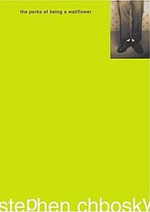
The other book cover we are looking at is the bestselling The Perks of Being a Wallflower by Stephen Chbosky. Honestly, there isn’t much to say about it because, well, there isn’t anything there. We have the title of the book in a size so tiny that the eyes are immediately skimming over it. The neon yellow is shocking enough for someone to pause, but there’s no substance to it. A picture of legs in the corner is supposed to reference the wallflower aspect of the main character but is largely forgettable. Which, in its own way, does the book justice because it’s about a forgettable main character. As a book cover design, however, no dice. You don’t want your audience to pass over the book completely when surrounded by much more realized book cover designs.
The frustrating and unfortunate aspect of book cover design is that everyone has their own opinion. There won’t be a universal take on your cover. Some will think it’s god’s gift to fantasy while others will balk and run away. Maybe not that exaggerated but you get the idea. At the end of the day, make sure the cover is something you are proud to see on the shelves and the audience will follow.
WHY YOUR COVER DESIGN IS HAMSTRINGING YOUR BOOK SALES AND YOU DIDN’T EVEN KNOW IT
